Overview
The Mission
To provide a fun way for users to communicate with different perspectives
Time Frame
1.5 weeks app design + 1.5 weeks video making
Team: 2 people
My Job: Design, Organize the project, Lead the progress, Video editing
My partner's job: working with me on most of the steps including ideation, wireframing, and design.
For this project, my partner and I worked closely together. Though I organized the project, we put in almost equal efforts and were involved in all parts of the process together.
BrainStorm& Strategy


Market Research
What we looked for:
Different forms of platforms
- Landing Page
- Relationship between posts' presentation style & platform culture
- How does the design inform the type of conversations & interactions on the platform, comment section, and overall culture?
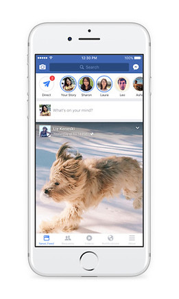
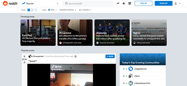
Most platforms are content focused and a few are user reaction focused
Content Focused


- Users need to perform an additional action to view comments & replies
- Strips/box format used to present content
- Texts & images have a similar hierarchy
- Most have a thumbnail of image, title, and text
Content + Reaction Focused

- Comments directly underneath the post, no additional action needed to see comments
- Need additional action to see replies to the comments
-> Results in a comment section dominated by individual opinions and likes rather than deeper conversations.
Reaction Focused


- No action needed to see replies to comments/comment threads.
- The visual hierarchy of comments emphasizes and encourages replies to previous comments (not only are replies to the original comment encouraged, but replies to other replies are also encouraged).
-> Result in conversation threads where each reply builds on the other. Often times one person would start a sentence and others would finish it.
Others

.png)
- Masonry or gallery format creates an Image-focused platform.
- Tinder uses a unique format that focuses the viewers' attention on one piece of content at a time. Its individual swiped cards, which take up the whole screen, emphasize the quality rather than the quantity of the content.
Conclusion
Debate - Reaction & Interaction Focused
Our app is a debate app, therefore:
- It focuses on the quality of the content rather than quantity. The topic & the richness of the comment section are what attract users.
-> Present posts one at a time rather than multiple posts on one screen.
- Encourages interactions (e.g. replies to comments).
-> Show voting on the same page as the content. Users shouldn't require additional actions to view comments and their replies.
- Visually displays distinct standpoints of a topic which is not a feature found on most platforms.
->Easy and clear visualization
RISD SPACE DESIGN

Discovering the possibility
RISD Space Design, previously known as RISD Rover, is a student-led club dedicated to competing in NASA Artemis Challenges.

ABOUT
What We’re All About
RISD Rover started out in 2010 with just a few people coming together to do what they love. Little did they know that it would grow into the thriving Space Design Club it is today. Our dedicated members enjoy meeting often to tackle NASA design challenges. Passion, dedication, and enthusiasm go hand-in-hand with everything we do.
Our door is always open to new members, no matter their experience level. We are proud to bring together people from all majors RISD and Brown. Come join us at our next event — we’d love to share all that RISD Space Designers has to offer.


Members of the 2020 Rover Team
Pictured are:
Owen, Neha, Max, Elena, Avantika, Victor, Caleb, Cade, Sebastian, Louis
Not Pictured:
Selena

Classic
Collection

You can never leave the rover!
Lily Douglas 19' currently works at NASA on the lunar rover
2017 Competiton
Pictured are:
Lily,


