Overview
The Mission
To provide a fun way for users to communicate with different perspectives
Time Frame
1.5 weeks app design + 1.5 weeks video making
Team: 2 people
My Job: Design, Organize the project, Lead the progress, Video editing
My partner's job: working with me on most of the steps including ideation, wireframing, and design.
For this project, my partner and I worked closely together. Though I organized the project, we put in almost equal efforts and were involved in all parts of the process together.
BrainStorm& Strategy


Market Research
What we looked for:
Different forms of platforms
- Landing Page
- Relationship between posts' presentation style & platform culture
- How does the design inform the type of conversations & interactions on the platform, comment section, and overall culture?
Most platforms are content focused and a few are user reaction focused
Content Focused
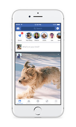

- Users need to perform an additional action to view comments & replies
- Strips/box format used to present content
- Texts & images have a similar hierarchy
- Most have a thumbnail of image, title, and text
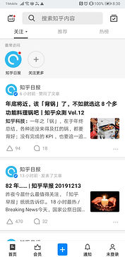
Content + Reaction Focused

- Comments directly underneath the post, no additional action needed to see comments
- Need additional action to see replies to the comments
-> Results in a comment section dominated by individual opinions and likes rather than deeper conversations.
Reaction Focused
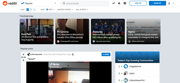

- No action needed to see replies to comments/comment threads.
- The visual hierarchy of comments emphasizes and encourages replies to previous comments (not only are replies to the original comment encouraged, but replies to other replies are also encouraged).
-> Result in conversation threads where each reply builds on the other. Often times one person would start a sentence and others would finish it.
Others

.png)
- Masonry or gallery format creates an Image-focused platform.
- Tinder uses a unique format that focuses the viewers' attention on one piece of content at a time. Its individual swiped cards, which take up the whole screen, emphasize the quality rather than the quantity of the content.
Conclusion
Debate - Reaction & Interaction Focused
Our app is a debate app, therefore:
- It focuses on the quality of the content rather than quantity. The topic & the richness of the comment section are what attract users.
-> Present posts one at a time rather than multiple posts on one screen.
- Encourages interactions (e.g. replies to comments).
-> Show voting on the same page as the content. Users shouldn't require additional actions to view comments and their replies.
- Visually displays distinct standpoints of a topic which is not a feature found on most platforms.
->Easy and clear visualization
RISD SPACE DESIGN

Micro-G Next
Lunar Surface EVA Operations – Sample Container Dispensing Device
Overview
The Mission
NASA plans to go to the Moon by 2024 with their Artemis Program. On the lunar surface, astronauts will collect geological samples during spacewalks, or Extravehicular Activities (EVAs), and will store each sample in an individual sample bag. In this challenge, the focus is finding a simple and reliable design that can dispense sample bags during a lunar spacewalk to aid in sampling operations.
Who it's for:
NASA Micro-g Neutral Buoyancy Experiment Design Teams
Time Frame
September 1st, 2020 - June 2021
Team: 11 people
Sebastian Boal - Rover Club Lead
Hannah Dunnigan - Team Lead, Design Lead
Noah Bingham - Technical Lead
Selena Yang - Outreach Lead, Video Production Co-Lead, Designer
Bowen Zhou - Designer, Outreach Co-Lead, Video Production Co-Lead
Jessica Young - Designer
Gun Bolukbasi - Designer
Felix Arwen - Writing Lead
Yu Hong Low - Member
Avantika Velho - Supporting Member (Fabrication)
Faculty Advisor
Jerome Arul, Micheal Lye

Design Goals
Design Goal
Design a sample bag dispenser for use during lunar surface sampling operations.
Design Needs
- Focus on the ease of use with limited hand dexterity in the spacesuit
- A sample bag dispenser that can hold multiple sample bags and dispense one bag at a time during sampling operations.
- Allow solo sampling operations, the sample bag dispenser will be carried by hand or mounted to the spacesuit or tool carrier.

Concept Proposal


The Design

Proposal Video
Feedback & Design Iterations
NASA's Feedback:
- The heat-treated self metal rim is an interesting idea
Positive aspects of the design:
1. The comb will keep the undeployed bags constrained and prevent tangling.
2. Push tab provides a method of deploying a single bag while keeping the others contained.
3. Simple lightweight design.
4. Seemingly one-handed operation.
Iteration Goals from NASA:
- Control the way the bag opens
- Control the speed the bag opens at and where it opens to
- Constrain the bag once they are opened
- Create design for reloading the dispenser
Iteration Stage 1


- designed a number of methods on how the dispenser bag would be opened and secured in place
- explored how the bags would be stored in the dispenser when not in use.
- Re considered the shape of the dispenser
Iteration Stage 2


.png)

- Designed a mechanism to secure the bags that are not being pulled by hand.
- Create a 1 bag at a time system
- Redesign the dispenser to have smaller weight and volume
- Start thinking about have the bags in a refill pack rather than being stored individually
Iteration Stage 3
.png)

.png)


- Designed the way the refill is attached.
- Strived for single-action dispensing
- Re-iterated to get rid of pinch points
- Looked for the simplest mechanism that is error-free and easy to manufacture
- Iterated on the way the bags are being moved from the container to the open position.
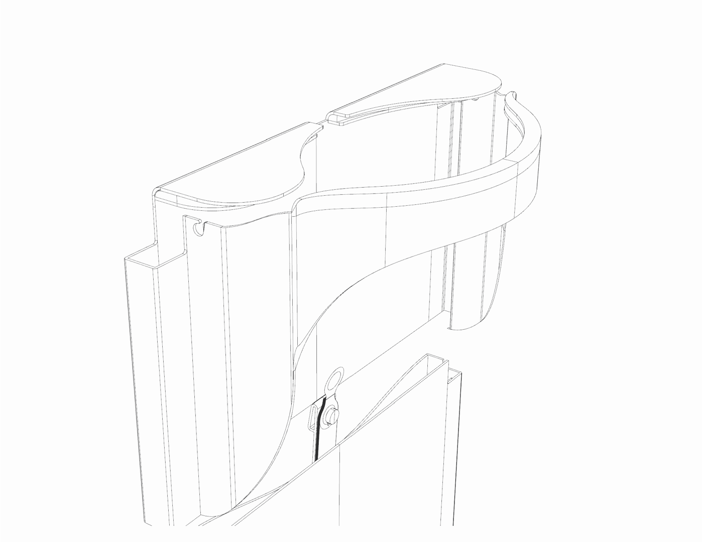
Final Design before Testing


Moving Forward
- 3 D Print Prototype
Testing & Iteration
-Metal Prototype
Testing & Iteration
- Metal final prototype
- Handing over to NASA for testing operations done in a simulated microgravity environment at NASA’s Johnson Space Center Neutral Buoyancy Laboratory in Houston