Overview
The Mission
To provide a fun way for users to communicate with different perspectives
Time Frame
1.5 weeks app design + 1.5 weeks video making
Team: 2 people
My Job: Design, Organize the project, Lead the progress, Video editing
My partner's job: working with me on most of the steps including ideation, wireframing, and design.
For this project, my partner and I worked closely together. Though I organized the project, we put in almost equal efforts and were involved in all parts of the process together.
BrainStorm& Strategy


Market Research
What we looked for:
Different forms of platforms
- Landing Page
- Relationship between posts' presentation style & platform culture
- How does the design inform the type of conversations & interactions on the platform, comment section, and overall culture?
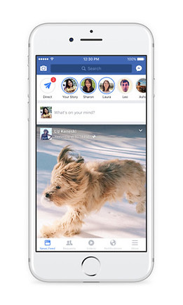
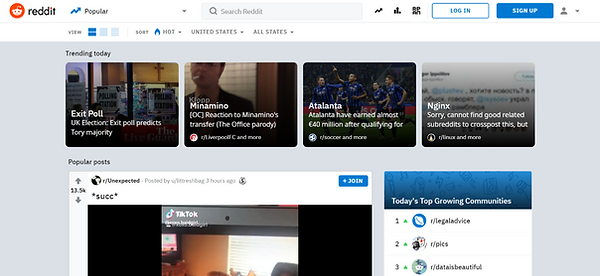
Most platforms are content focused and a few are user reaction focused
Content Focused


- Users need to perform an additional action to view comments & replies
- Strips/box format used to present content
- Texts & images have a similar hierarchy
- Most have a thumbnail of image, title, and text
Content + Reaction Focused

- Comments directly underneath the post, no additional action needed to see comments
- Need additional action to see replies to the comments
-> Results in a comment section dominated by individual opinions and likes rather than deeper conversations.
Reaction Focused


- No action needed to see replies to comments/comment threads.
- The visual hierarchy of comments emphasizes and encourages replies to previous comments (not only are replies to the original comment encouraged, but replies to other replies are also encouraged).
-> Result in conversation threads where each reply builds on the other. Often times one person would start a sentence and others would finish it.
Others

.png)
- Masonry or gallery format creates an Image-focused platform.
- Tinder uses a unique format that focuses the viewers' attention on one piece of content at a time. Its individual swiped cards, which take up the whole screen, emphasize the quality rather than the quantity of the content.
Conclusion
Debate - Reaction & Interaction Focused
Our app is a debate app, therefore:
- It focuses on the quality of the content rather than quantity. The topic & the richness of the comment section are what attract users.
-> Present posts one at a time rather than multiple posts on one screen.
- Encourages interactions (e.g. replies to comments).
-> Show voting on the same page as the content. Users shouldn't require additional actions to view comments and their replies.
- Visually displays distinct standpoints of a topic which is not a feature found on most platforms.
->Easy and clear visualization
RISD SPACE DESIGN

Rover
Human Rover Exploration Challenge
Overview
The Mission
Design, development, and test of a human-powered rover and accompanying components for successfully navigating more than a 0.50-mile course inclusive of mission tasks within the allotted time. The team with the highest number of points accumulated throughout the project year in each category (high school and college) will be the winner. In case of a tie, the team with the fastest excursion completion time will be the winner.
Who it's for:
NASA Human Exploration Rover Challenge
Time Frame
9 months
Team:
Faculty Advisor
Micheal Lye

Design Goals
Design Goal
Design and create human-powered rovers capable of traversing a challenging exoplanetary -like landscape
Design Needs
- Vehicle shall be designed for both speed and the ability to help perform obstacles on the unique terrain
- Vehicle shall meet the 5 x 5 x 5-foot volume constraint in the collapsed position
- Vehicle must be human-powered with no protruding sharp edges with robust seat restraints
- Vehicle must be capable of traversing hills up to 5 feet high and inclined up to 30 degrees in their direction of travel and have a turning radius of 15-foot or less.
Design Iterations
NASA's Feedback:
- The heat-treated self metal rim is an interesting idea
Positive aspects of the design:
1. It collapsable and fit in 5 x 5 ft cube
2.
Iteration Goals from NASA:
- Control the way the bag opens
- Control the speed the bag opens at and where it opens to
- Constrain the bag once they are opened
- Create design for reloading the dispenser
2021
2020

2019

2018
2017

2016
