Overview
The Mission
To provide a fun way for users to communicate with different perspectives
Time Frame
1.5 weeks app design + 1.5 weeks video making
Team: 2 people
My Job: Design, Organize the project, Lead the progress, Video editing
My partner's job: working with me on most of the steps including ideation, wireframing, and design.
For this project, my partner and I worked closely together. Though I organized the project, we put in almost equal efforts and were involved in all parts of the process together.
BrainStorm& Strategy


Market Research
What we looked for:
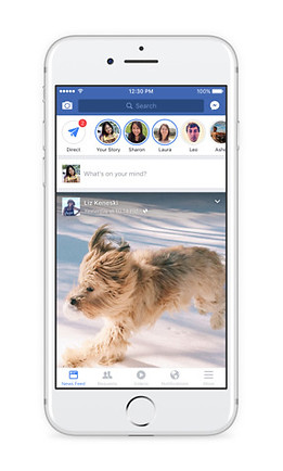
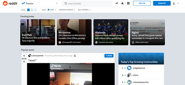
Different forms of platforms
- Landing Page
- Relationship between posts' presentation style & platform culture
- How does the design inform the type of conversations & interactions on the platform, comment section, and overall culture?
Most platforms are content focused and a few are user reaction focused
Content Focused


- Users need to perform an additional action to view comments & replies
- Strips/box format used to present content
- Texts & images have a similar hierarchy
- Most have a thumbnail of image, title, and text
Content + Reaction Focused

- Comments directly underneath the post, no additional action needed to see comments
- Need additional action to see replies to the comments
-> Results in a comment section dominated by individual opinions and likes rather than deeper conversations.
Reaction Focused


- No action needed to see replies to comments/comment threads.
- The visual hierarchy of comments emphasizes and encourages replies to previous comments (not only are replies to the original comment encouraged, but replies to other replies are also encouraged).
-> Result in conversation threads where each reply builds on the other. Often times one person would start a sentence and others would finish it.
Others

.png)
- Masonry or gallery format creates an Image-focused platform.
- Tinder uses a unique format that focuses the viewers' attention on one piece of content at a time. Its individual swiped cards, which take up the whole screen, emphasize the quality rather than the quantity of the content.
Conclusion
Debate - Reaction & Interaction Focused
Our app is a debate app, therefore:
- It focuses on the quality of the content rather than quantity. The topic & the richness of the comment section are what attract users.
-> Present posts one at a time rather than multiple posts on one screen.
- Encourages interactions (e.g. replies to comments).
-> Show voting on the same page as the content. Users shouldn't require additional actions to view comments and their replies.
- Visually displays distinct standpoints of a topic which is not a feature found on most platforms.
->Easy and clear visualization
RISD SPACE DESIGN

Big Idea Challenge
Designing a three-layer Lunar Dust Mitigation technology
Overview
The Mission
The Big Idea Challenge is a contest hosted by NASA. In this challenge, teams design, build, and test new dust mitigation technologies that can be applied in lunar applications. Our objective is to design a solution for pertinent issues such as dust clinging to spacesuits and optical systems, dust clouds that form upon landing, and hazardous in-cabin particulate levels.
Who it's for:
NASA The National Institute of Aerospace (NIA)
Time Frame
October 2020 - December 2021
Team: 16 people
LEADERSHIP:
Anthony Capobianco - Team Lead
Hannah Skye Dunnigan - Design Lead
TEAMS:
Matlab Modeling
Anthony Capobianco, Justin Rhee, Luke Randall, Noah Bingham, Daniel Marella
Alternative Applications Research
Viola Tan, Bowen Zhou, Selena Yang, Sebastian Boal, Avantika Velho
Fibers Prototyping
Hannah Skye Dunnigan, Felix Arwen, Avantika Velho, Peyton Newman, Selena Yang
Static Generator
Luke Randall, Peyton Newman, David Fang, Daniel Marella, Bowen Zhou
In-Person Testing
Luke Randall, Peyton Newman, Noah Bingham, Hannah Skye Dunnigan, Felix Arwen
Writing
Luke Randall, Noah Bingham, Bowen Zhou, Sebastian Boal, Viola Tan, Hannah Skye Dunnigan
Video and Graphics
Bowen Zhou, Viola Tan, Selena Yang
Administration
Anthony Capobianco, Hannah Skye Dunnigan, Sebastian Boal, Luke Randall, Noah Bingham, Avantika Velho
FACULTY ADVISORS
Rick Fleeter - BSE Faculty Advisor
Christopher Bull - Principal Investigator

Design Goals
Design Goal
TEST-RAD aims to prevent damage to life support functionalities, reduce the deterioration of the seals on the suit, and create a higher standard of safety for astronauts.
Design Needs
- Regolith is highly abrasive, cohesive, and adhesive. The latter is due to the dust’s tendency to be electrostatically charged and aggravates the dust removal process.
- lunar dust affects all outer garments, especially lower limbs, seals, and bearings. Extensive wear of these sensitive joints over long periods of time could potentially induce catastrophic failures of the suit.
Protection of sensitive joint areas is of critical importance. The accumulation and cohesion of glassy particles can cause an exponential loop of abrasion. This may create a negative feedback loop in extreme scenarios where dust entering a joint induces abrasion, which thus increases the size of the joint and lets in more dust. Dust accumulation problems from spacesuit joints can result in difficulty in spacesuit management of bearings to tearing of the outer layers.
The Design
