Overview
The Mission
To provide a fun way for users to communicate with different perspectives
Time Frame
1.5 weeks app design + 1.5 weeks video making
Team: 2 people
My Job: Design, Organize the project, Lead the progress, Video editing
My partner's job: working with me on most of the steps including ideation, wireframing, and design.
For this project, my partner and I worked closely together. Though I organized the project, we put in almost equal efforts and were involved in all parts of the process together.
BrainStorm& Strategy


Market Research
What we looked for:
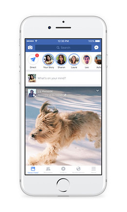
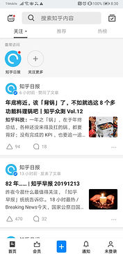
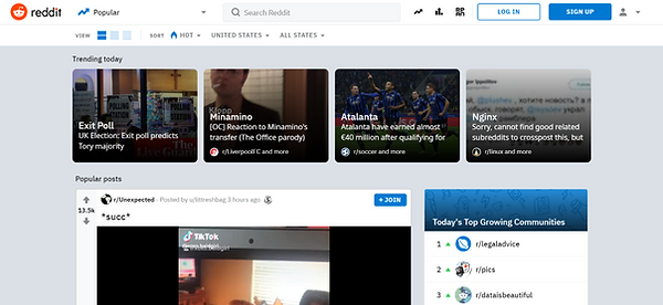
Different forms of platforms
- Landing Page
- Relationship between posts' presentation style & platform culture
- How does the design inform the type of conversations & interactions on the platform, comment section, and overall culture?
Most platforms are content focused and a few are user reaction focused
Content Focused


- Users need to perform an additional action to view comments & replies
- Strips/box format used to present content
- Texts & images have a similar hierarchy
- Most have a thumbnail of image, title, and text
Content + Reaction Focused

- Comments directly underneath the post, no additional action needed to see comments
- Need additional action to see replies to the comments
-> Results in a comment section dominated by individual opinions and likes rather than deeper conversations.
Reaction Focused


- No action needed to see replies to comments/comment threads.
- The visual hierarchy of comments emphasizes and encourages replies to previous comments (not only are replies to the original comment encouraged, but replies to other replies are also encouraged).
-> Result in conversation threads where each reply builds on the other. Often times one person would start a sentence and others would finish it.
Others

.png)
- Masonry or gallery format creates an Image-focused platform.
- Tinder uses a unique format that focuses the viewers' attention on one piece of content at a time. Its individual swiped cards, which take up the whole screen, emphasize the quality rather than the quantity of the content.
Conclusion
Debate - Reaction & Interaction Focused
Our app is a debate app, therefore:
- It focuses on the quality of the content rather than quantity. The topic & the richness of the comment section are what attract users.
-> Present posts one at a time rather than multiple posts on one screen.
- Encourages interactions (e.g. replies to comments).
-> Show voting on the same page as the content. Users shouldn't require additional actions to view comments and their replies.
- Visually displays distinct standpoints of a topic which is not a feature found on most platforms.
->Easy and clear visualization
RISD SPACE DESIGN

ABOUT US
A Group with a Common Passion
RISD Rover was founded in 2010 after a group of individuals decided to turn their shared interests in competing in Rover Human Exploration Challenge. Since then we’ve grown as a community, and have expanded into a space design club competing in multiple challenges. When you decide to join us, you too will gain valuable designing experience and, most importantly, to a group of like-minded individuals who are just as passionate as you are.